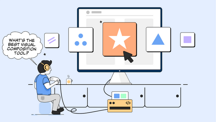
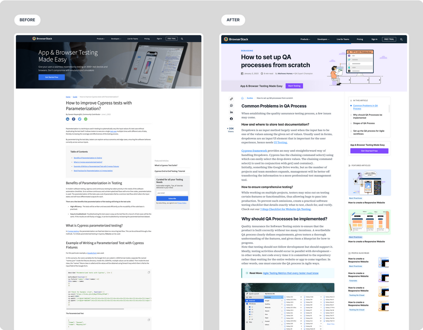
In my creative exploration, I conceived the idea of featuring curious developers as the main characters in our illustrations. They would interact with different UI elements in their quest for answers. To achieve scalability, I devised an approach by using smaller spot illustrations arranged like Lego pieces to create hero visuals. This concept forms an illustration system that can be easily scaled for our guides, ensuring a friendly and cohesive visual experience.
Lego Blocks of illustration system
We wanted bring a sense of excitement and relatability to our illustrations. Our goal was to create a unique illustration style for BrowserStack that would be easily scalable. Throughout the creative process, we ventured into multiple styles and directions, exploring various possibilities to find the perfect fit.
Making it Unique
To align with our business goals and ensure scalability, I created new UI components while refining existing ones. Drawing insights from past experiments, I fine-tuned some components to make them more engaging. The aim was to foster user engagement and ignite conversions, ensuring a seamless and rewarding experience for our audience
Growth components
In my quest to create a great optimised guide page, I embarked on a creative journey filled with endless concepts and variations. I explored diverse layouts, experimented with various styles of illustrations and played with typography scale. As I delved into this exciting phase, I encountered the challenge of harmonising multiple elements while establishing the perfect hierarchy for delivering the right information.
Catalyse authentic personality
To kickstart the redesign process, I conducted thorough market research and analyzed the competition. Through this analysis, I identified key problems and opportunities in the current guide pages.
Improved Readability with Typography: We recognized that content readability is pivotal in engaging users. Therefore, I introduced a new typography system that enhanced the legibility and readability of the guide pages.
Optimized Page Layout: To elevate the user experience, I optimized the page layout by reorganizing the content more intuitively and structurally. This streamlined layout reduced cognitive load, enabling users to navigate the guide pages effortlessly.
Incorporation of Custom Illustrations: Throughout the guide pages, I introduced visually appealing and contextually relevant illustrations. These illustrations not only added visual interest but also served as visual cues to guide users through the content.
Strategic Growth Components and Micro Experiments: Acknowledging the importance of driving signups, we strategically integrated new growth components into the guide pages. We also planned these components as separate micro experiments, allowing us to iterate and optimize for maximum impact.
Updated and Consistent Design System: To ensure a cohesive and seamless experience, we developed an updated and consistent design system for the guide pages. This establishment of a robust design system created a scalable foundation that would facilitate future iterations and expansion of the guide product.
Course of remedy
BrowserStack is an cloud web and mobile testing platform that provides developers with the ability to test their websites and mobile applications across on-demand browsers, operating systems and real mobile devices.
OBJECTIVE
TOOLS
The primary objective of this project was to drive 2X engagement numbers for the Guide product by improving the readability of the Guide pages.The secondary objectives included increasing average pages per session duration and setting the foundation for rapid experimentation and scaling of articles from 1000 to 5K+
Figma | Elementor(Wordpress)
CHALLENGES
Challenge 1: Scaling Guide Product for Traffic Growth
BrowserStack aims to increase traffic from 1 million to 10 million for the Guide Product to drive growth. The primary challenge is to scale the Guide Product effectively to achieve this ambitious traffic target.
Challenge 2: Modernizing Outdated Guide Pages for Enhanced Engagement
The content and design need a refresh to meet modern standards and engage users effectively. Additionally, there is a scarcity of components available for experimentation on these pages, which hinders innovation and improvement efforts.
BrowserStack
Guides Revamps
2022
Web Design | Visual Design | UI/UX | Development
Results and Impact
3x
Increase in overall page shares
10%
Improvement in scroll depth
4%
increase in average pages per session
To align with our business goals and ensure scalability, I created new UI components while refining existing ones. Drawing insights from past experiments, I fine-tuned some components to make them more engaging. The aim was to foster user engagement and ignite conversions, ensuring a seamless and rewarding experience for our audience.
Onboarding

Branding | Development | Illustration | UI/UX
Onboarding

Branding | Development | Illustration | UI/UX
Other Projects


