Early Insight
To understand the problems faced by new users, I teamed up with our product manager and started looking at support tickets, attended onboarding sessions and started digging into analytics. We found four main problems.

Unclear Product choices
There were no products choice screens. Users found it difficult to understand which product is best suited for their use case.

Email Issues
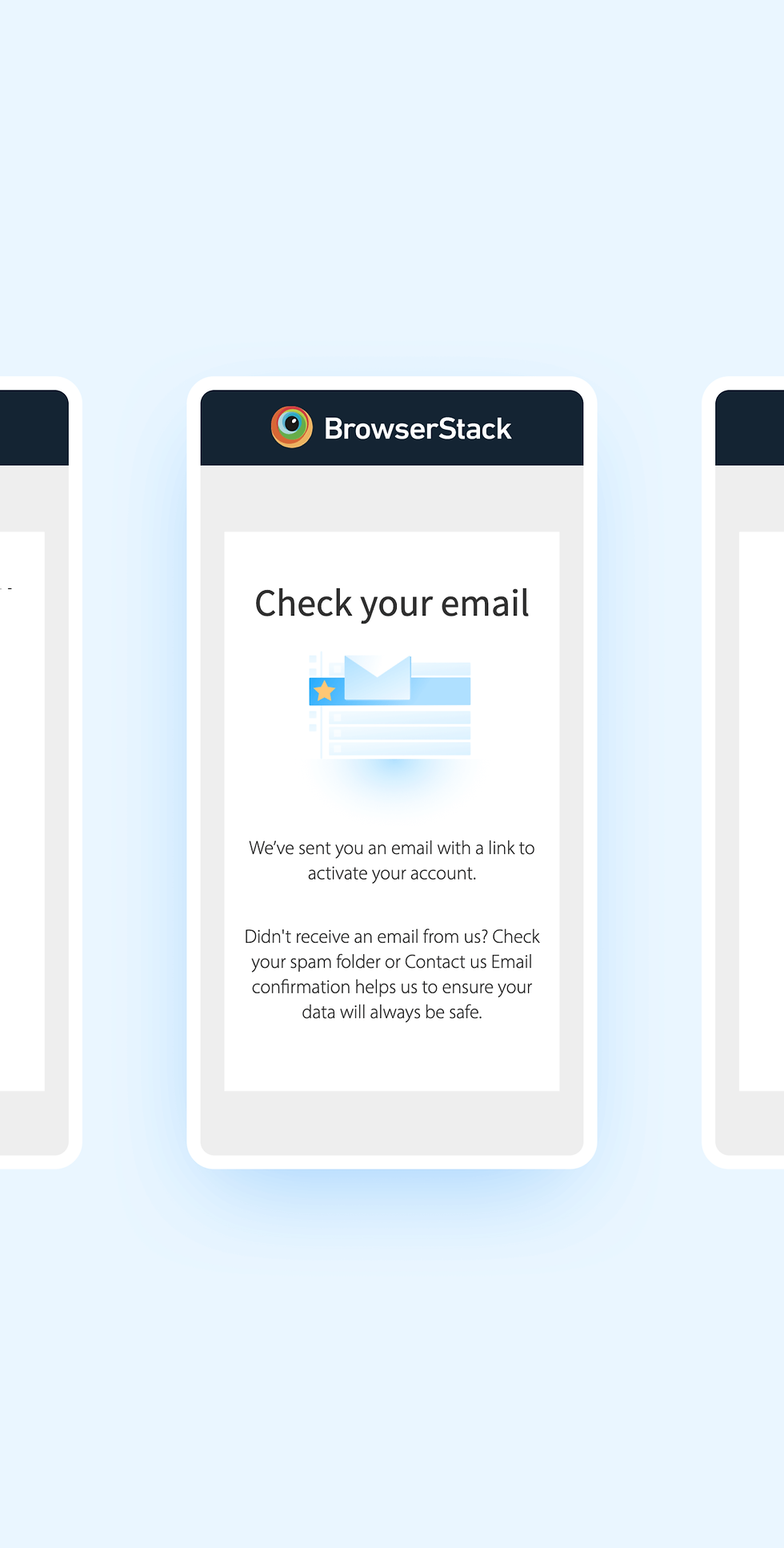
After the user signs up, there was no clear communication for the users to check his inbox for the invitation link.

Visual Inconsistency
Onboarding screens consisted of many visual inconsistencies that either affected the entire company or an individual user.

No clear progess
There was no progress bar or indicator to know how many steps are involved in sign-up. This also limited our ability to run A/B tests.


BrowserStack
Designing the user onboarding flow for the world's largest testing infrastructure.
About the company
BrowserStack is a cloud web and mobile testing platform that provides developers the ability to test their websites and mobile applications across on-demand browsers, operating systems and real mobile devices. They have four primary products- Live, App Live, Automate and App Automate.
Objective
-
Products Discovery - Users after signing up was taking directly to our manual testing product Live. There was no product choice screen to choose the right product for their use case.
-
Inconsistent visual language - After running a lot of experiments, there were a lot of visual inconsistencies between the onboarding screens. we needed to bring a fresh consistent look.
-
Reduce user drop-offs & collect user data - This is always a tricky part of any product, getting users to give their information PLUS signing up, This usually creates friction, this was going to be our biggest challenge.
Tools Used
Sketch
Principle
Adobe After Effects
Adobe Premier Pro
Lucid charts
The Solution: Incremental Wins
Rather than tackle all these problems at once, we grouped them into phases. Each phase could be built independently and deliver value to our users. We focused on improving the design/interaction with the sign-up screens to reduce drop-offs, as well as ensuring critical data collection(persona) can be continued.

Making cuts
I started by creating user flows and wireframing our current process. I worked with PMs and engineers to determine what steps were essential and where we can improve.


Paving the way for customization
Instead of the product choice screens which directly asked the user to pick a product, We designed a simple questionnaire that will guide users to find the most suitable product for their use cases.
All screens where designed making sure that it's responsive across all the device resolutions.

I created and animated various illustrations based on different users selections to guide them through the process and giving them context of his previous selection.
The Impact
-
The overall activation rates of the users increased.
-
Interactions with the screens were higher for the new design. This indicated that the users are more comfortable with the questionnaire-based product choice screens. We also have a better idea of our population in terms of interest in websites vs Apps now.
-
Product discovery increased, we noticed that people now started discovering our App testing products and was able to discover products for their use case.
Paving the way for customization
Instead of Product Choice screen which directly asks the user to pick a product, We designed a simple questionnaire which will help our user find the most suitable product for his use case.
User sign up increased
+18%
App Live Products activation increased
+8%
Email click through rates increased